Accessibility
In this section will be grouped all materials dedicated to accessibility.
Download and Read the Leaflet of the performance “Let’s Pass – The Joy of Life”
These PDF has been created with the needs of blind and visually impaired individuals in mind, to be read and navigated using assistive technologies.
The LIA Foundation has assessed the accessibility of the PDF and InDesign versions of the program for the event “Let’s Pass! The Joy of Life.”
An audit was conducted on the graphic layout and content, and a report was compiled to verify its level of accessibility and identify issues based on the specifications of international and national guidelines for accessibility standards.
The audits checked the compliance level with the Web Content Accessibility Guidelines (WCAG) 2.2 AA, the guidelines defined by the World Wide Web Consortium (W3C), which are considered the standard reference for the accessibility of digital content.
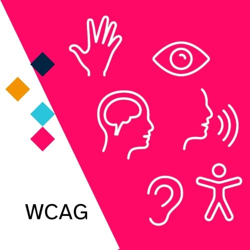
The website developed in accordance with the Web Content Accessibility Guidelines (WCAG) 2.1 of which. https://www.w3.org/Translations/WCAG21-it/ which define technical specifications for making Web content more accessible to people with disabilities (including visual, hearing, physical).
They make Web content more usable by older people with aging-related skill changes and generally improve usability for all users. WCAG 2.1, based on the W3C process, provides a shared standard for Web content accessibility that meets the needs of individuals, organizations, and governments internationally. WCAG 2.1 is designed to apply broadly to various Web technologies both now and in the future, as well as to be verifiable through a combination of automated testing and human evaluation.
The site implemented with AccessiWidget that enhances the accessibility of the website thanks to two components working simultaneously: the Artificial Intelligence and the Accessibility Interface.
We’ve created an accordion-style booklet designed for young children, allowing them to play with one of the stage elements from the performance: paper.
Paper is a symbol of the cycle of life: it starts from trees, from nature, takes on different forms, and is recycled at the end of its life. It can be used in many ways: for writing, drawing, making coins, as packaging, wallpaper, kitchen paper, toilet paper, and even for building. But paper can also be used for dancing and self-expression. Through the booklet, we can together discover many ways to experience a sheet of paper, just as the artists will do during the performance.
The booklet, available in different languages, has been designed to be accessible to all: it includes a QR code that provides an audio description in the languages of all partner countries (English, Italian, Greek, Finnish, Czech).
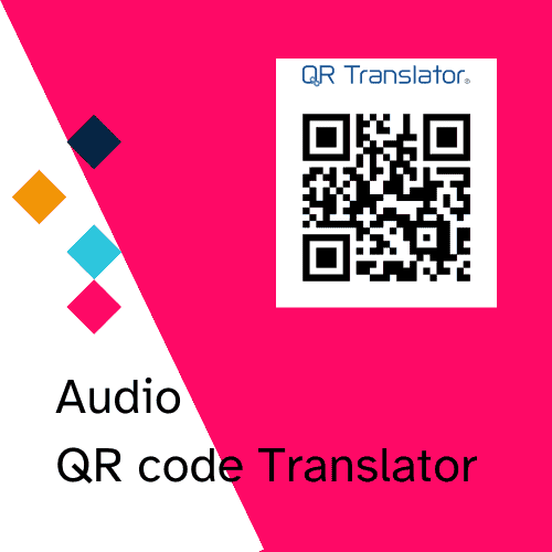
The inclusion of an audio QR code in a poster is an important step towards inclusivity, allowing access to an audio description for individuals with visual impairments. Through this QR code, users can listen to a detailed description of the poster’s content in audio format. Additionally, thanks to artificial intelligence, the audio description can be automatically translated into the selected languages (English, Italian, Greek, Finnish, and Czech), making the content accessible to an international audience. This technology not only enhances accessibility but also promotes more inclusive and global communication, breaking down language barriers and making information available to everyone.
Here is an example of the posters created:
Let’s Pass – The Joy of life_poster_FI
Let’s Pass – Tho Joy of life _poster_GR
Let’s Pass_The Joy of life_poster_CZ
Let’s Pass – The Joy of life _poster_IT
Let’s Pass – The Joy of life _poster _ENG_FI
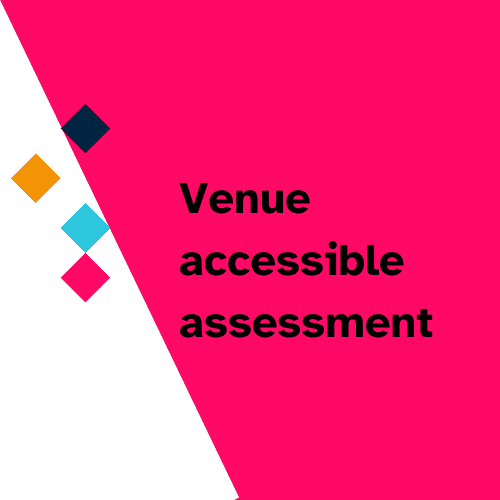
For each performance venue, a “Venue Accessibility Assessment” was carried out, which is a detailed evaluation of the venue’s accessibility. The aim of this process was to analyze and improve access and the experience for all people, particularly those with disabilities. Various aspects were considered, such as the accessibility of spaces, services, and facilities, to ensure that all participants can enjoy the performances comfortably and safely, regardless of their specific needs.
ITALY_Parma, CPM Toscanini_Venue accessibility assessment
FINLAND_Tampere_Artteli_Venue accessibility assessment
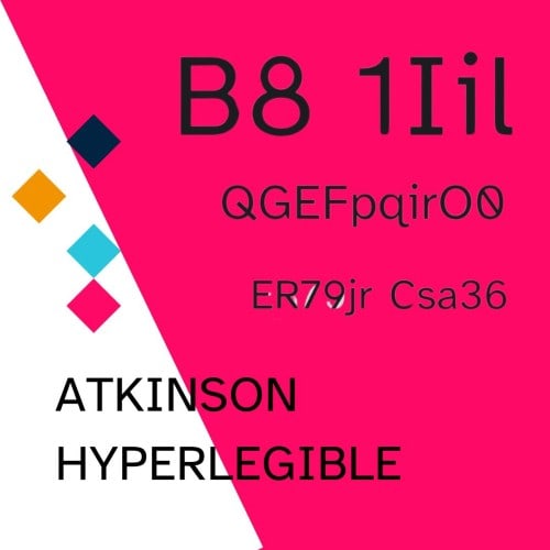
The font chosen for the communication of the PASS Project is Atkinson Hyperlegible
Atkinson Hyperlegible is a freely available typeface built around a grotesque sans-serif core, intended to be optimally legible for readers who are partially visually impaired, with all characters maximally distinguishable from one another. It was developed by the Braille Institute of America in collaboration with Applied Design Works and is available under the SIL Open Font License. It won Fast Company’s Innovation by Design Award for Graphic Design in 2019 and was shortlisted for a graphic design award by Dezeen in 2020.